04 / UX & Web
Political
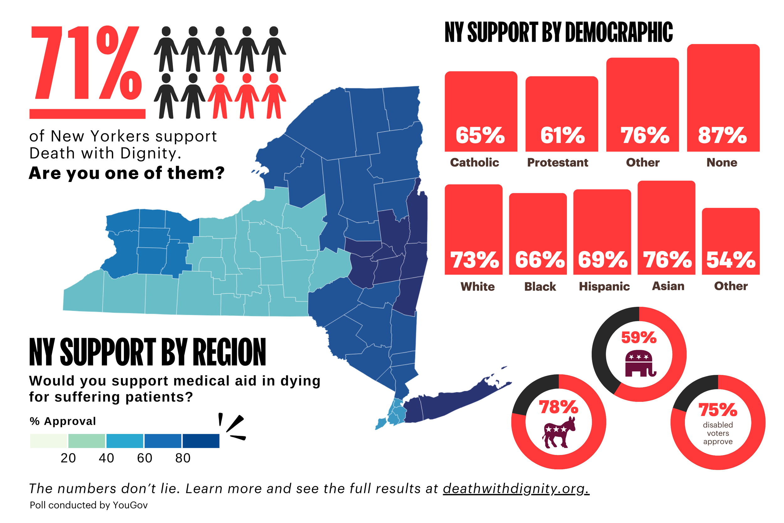
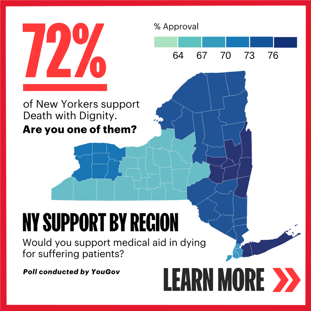
Death with Dignity, the nonprofit, had been working to pass legislation in New York for years. With this project, we wanted to emphasize the widespread support for medical aid in dying legislation across both geographic and socioeconomic demographics in the state.
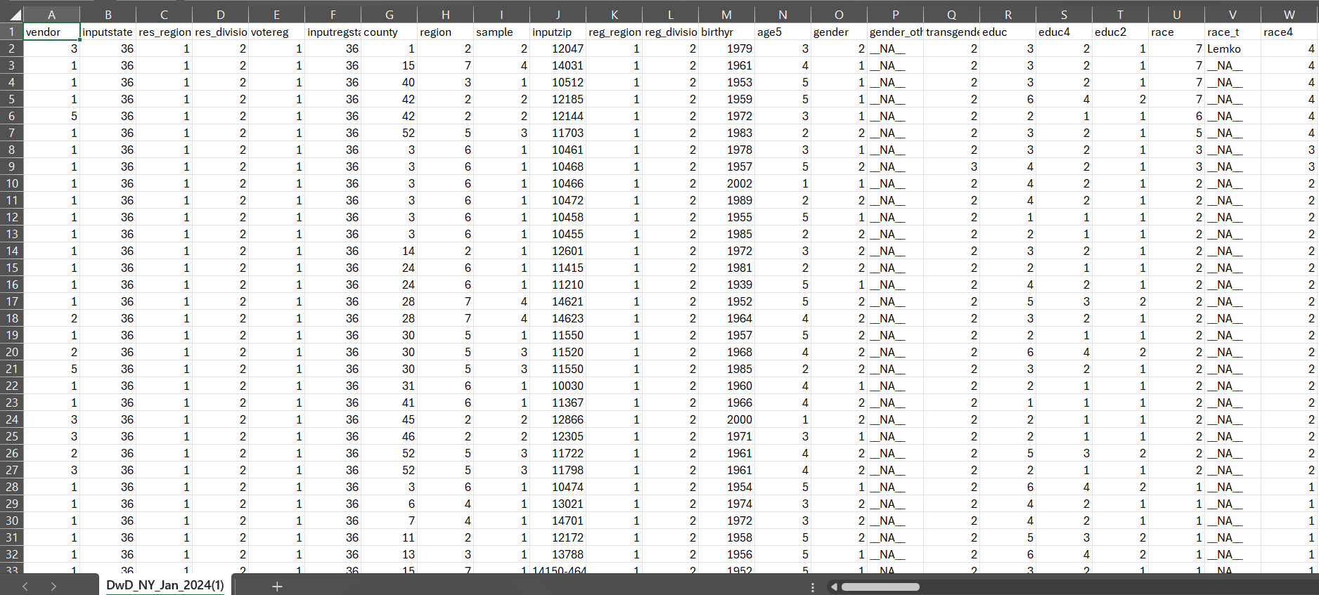
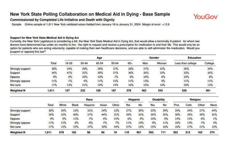
I was given a spreadsheet of raw survey data; a spreadsheet with 1600+ rows and 120 columns of variables, on everything from birth year and political affiliation, to religion and county.
I trimmed down the data and selected the strongest variables and most relevant points for potential use.
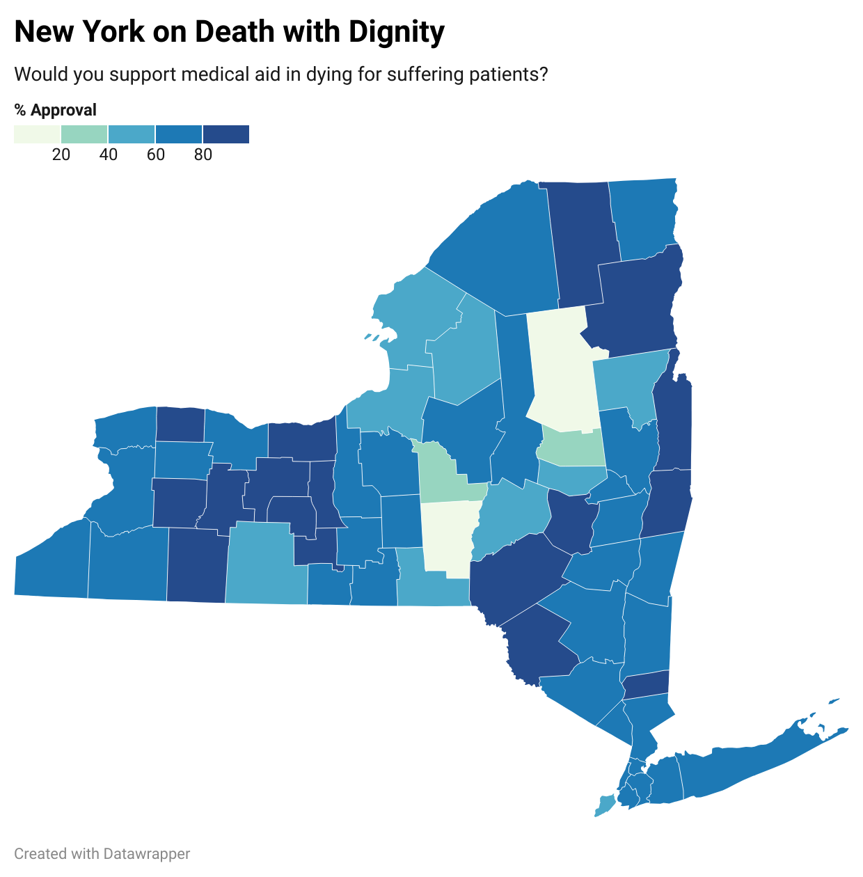
I decided early on that I wanted the graphic to focus around a chloropleth map: a form of color-based data mapping.
After sorting the raw data by region, I used DataWrapper to map the pared-down data to geographic variables. I wanted to prioritize showing the overall support from New York, as well as the geographic breakdown and a handful of key demographics.
I decided that my original county-based map showed too much room for error, due to the disparity in population density, and instead moved forward with a region-based map.
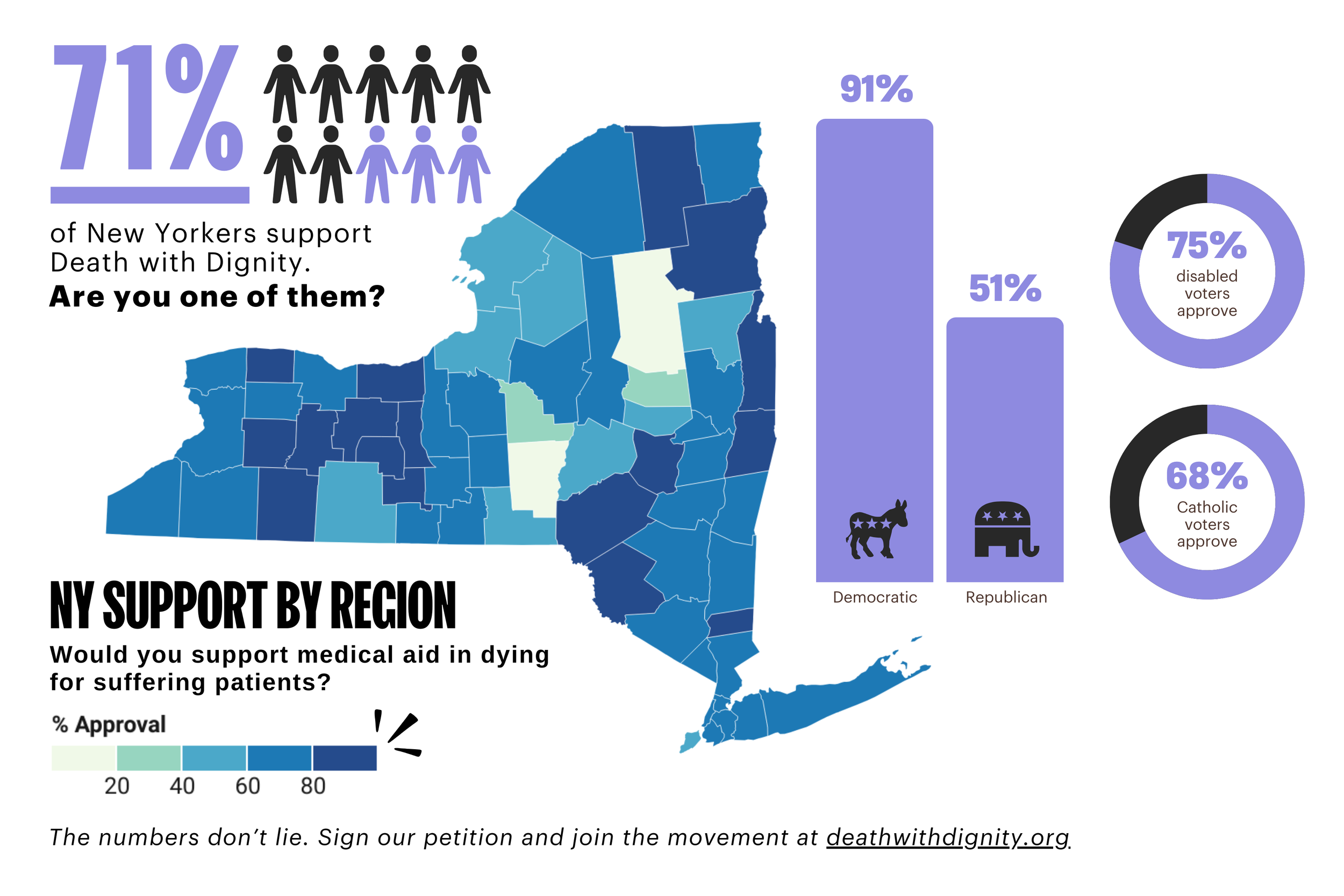
With the main graphic and accompanying social and email, we were able to demonstrate to state legislators the widespread support for this bill among their voters, as well as increase awareness of this issue among the New York public and invigorate our audience to show their support.